跳到内容
跳到内容 

Why This Matters: Save Time and Avoid Unnecessary Revisions
Many brands waste time going back and forth due to incorrect design file formats or missing elements. A properly prepared file not only saves communication time but also ensures better printing results and faster delivery. This short guide will help you send everything correctly the first time
Step 1: Confirm Paddle Material & Size Before Designing
Before you begin your design, please confirm the paddle’s material (e.g. carbon fiber, 3K, Kevlar) and size (e.g. 14mm hybrid head, 16mm flat head). Once confirmed, we will send you the corresponding paddle template file. You’ll need to insert your design into that template
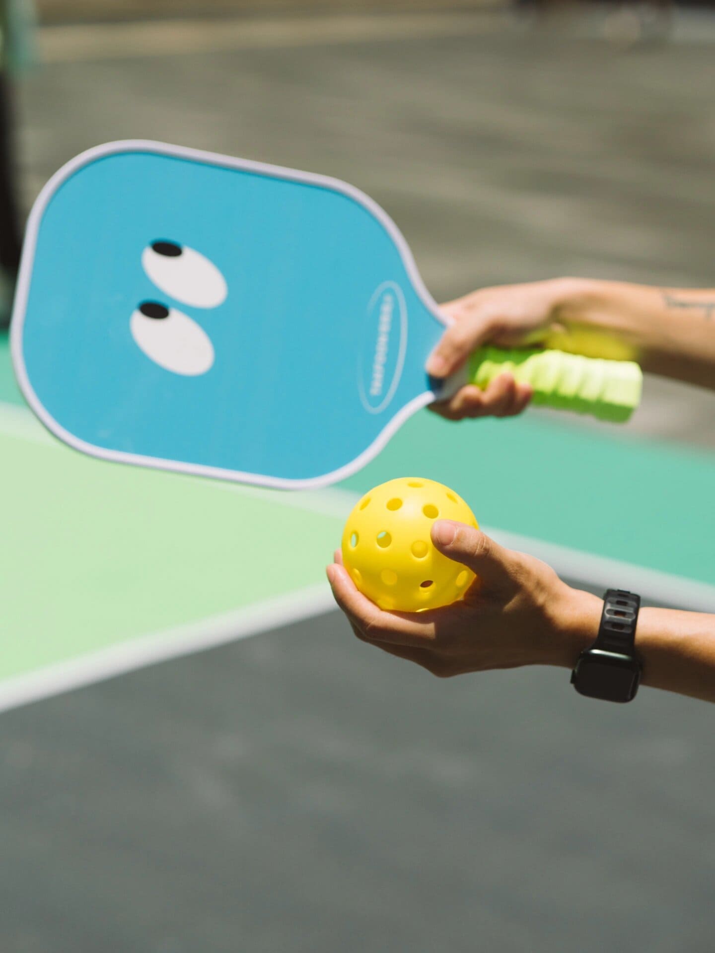
Step 2: Design Only the Paddle Face Area
Please only design the paddle surface, not the handle, grip, edge guard, or any other accessories. Your design should stay completely within the outline area of the template we provide. Do not include any extra elements outside of the paddle face.
Step 3: Use Vector Format, No Raster Images
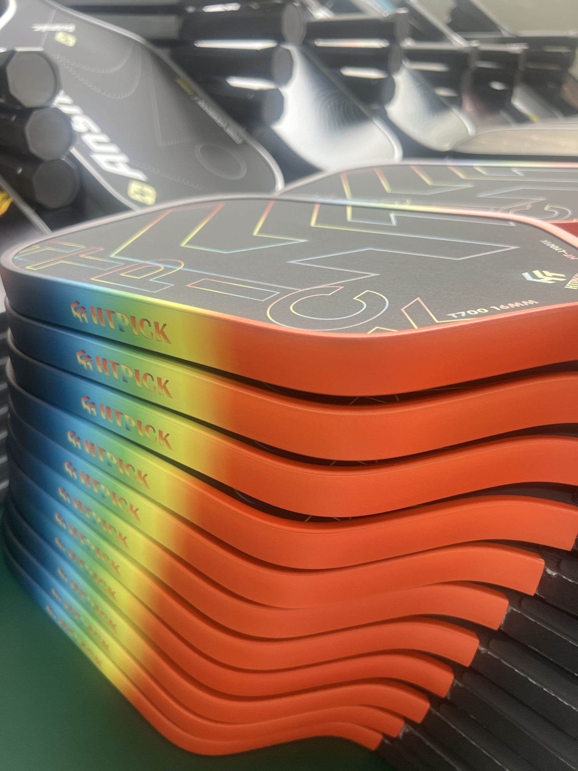
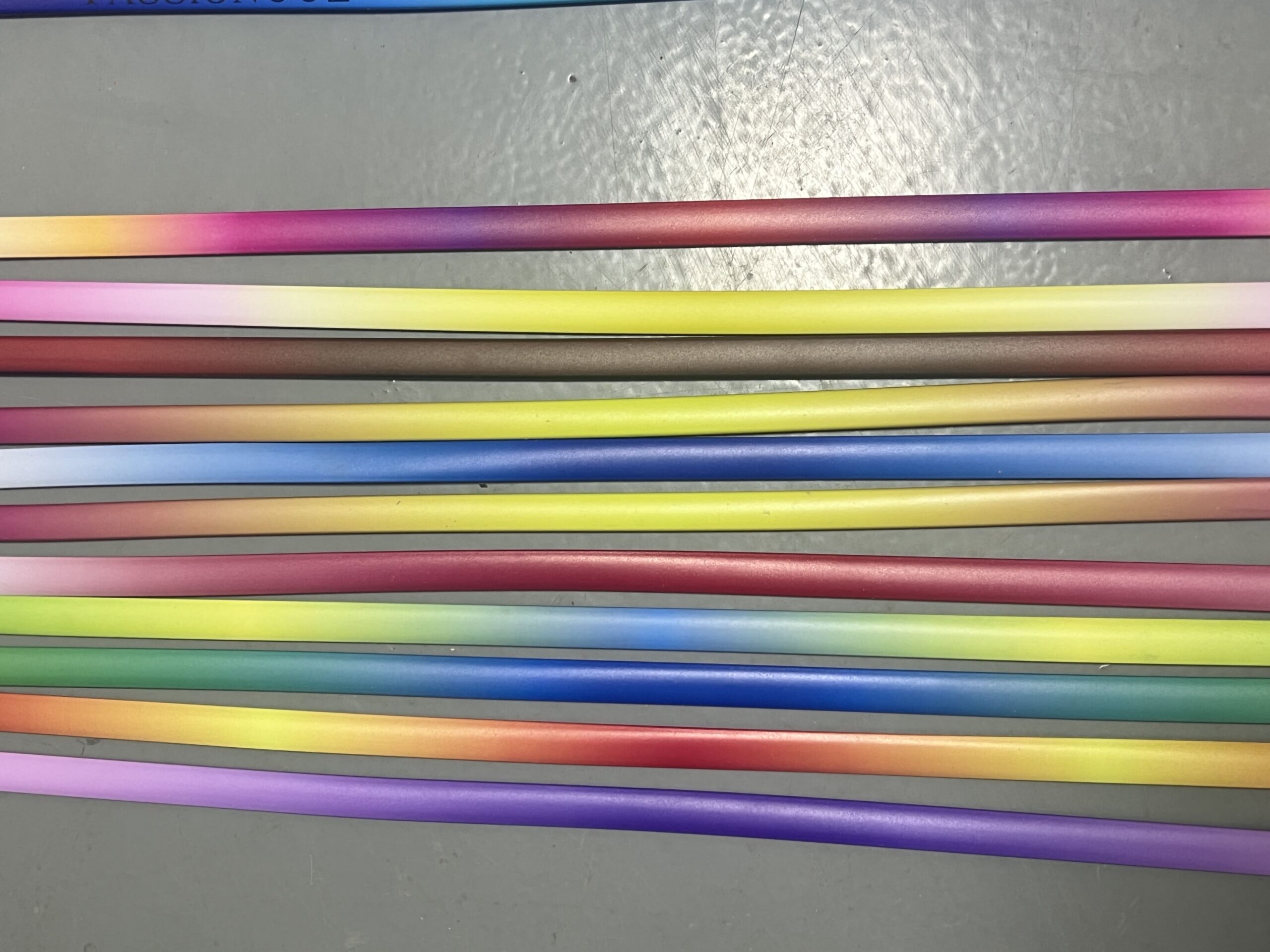
Your design file must be in vector format (such as AI or PDF). Please do not send JPG, PNG, or other raster images, as they become blurry when enlarged and will affect printing quality. Vector files ensure clarity and precision during production.
Step 4: Merge Layers and Create Outlines
Please merge all design layers before sending the file. Also, make sure all fonts have been converted to outlines. In most design software, you can do this by right-clicking the text and selecting “Create Outlines” This prevents font compatibility issues and ensures we receive the exact layout as intended.
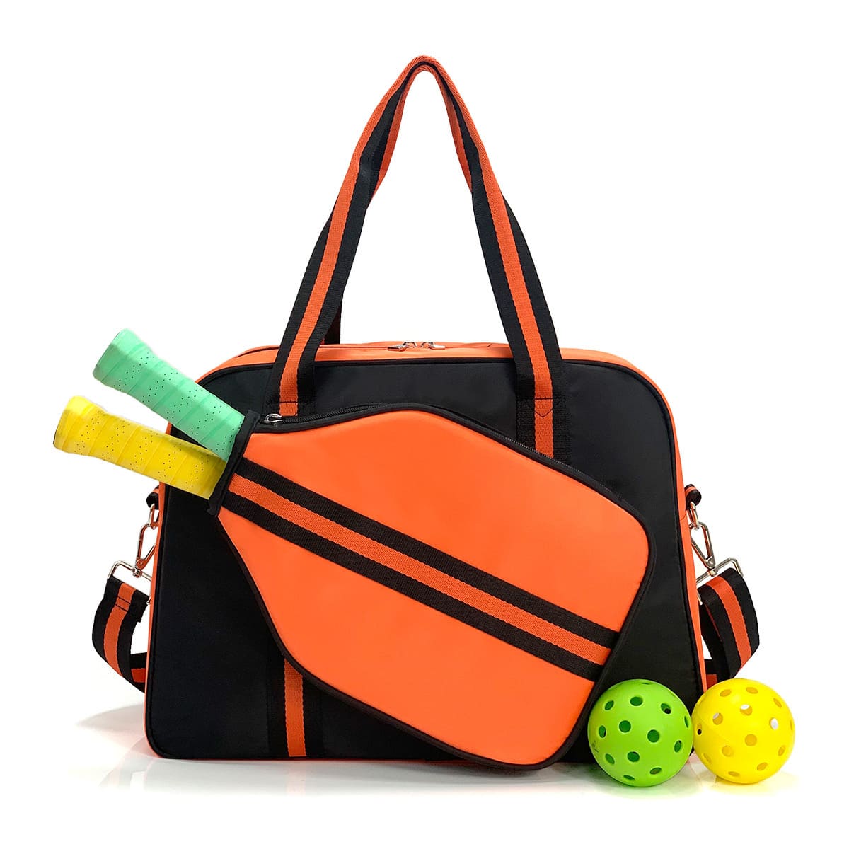
Accessory Designs Must Be Sent Separately
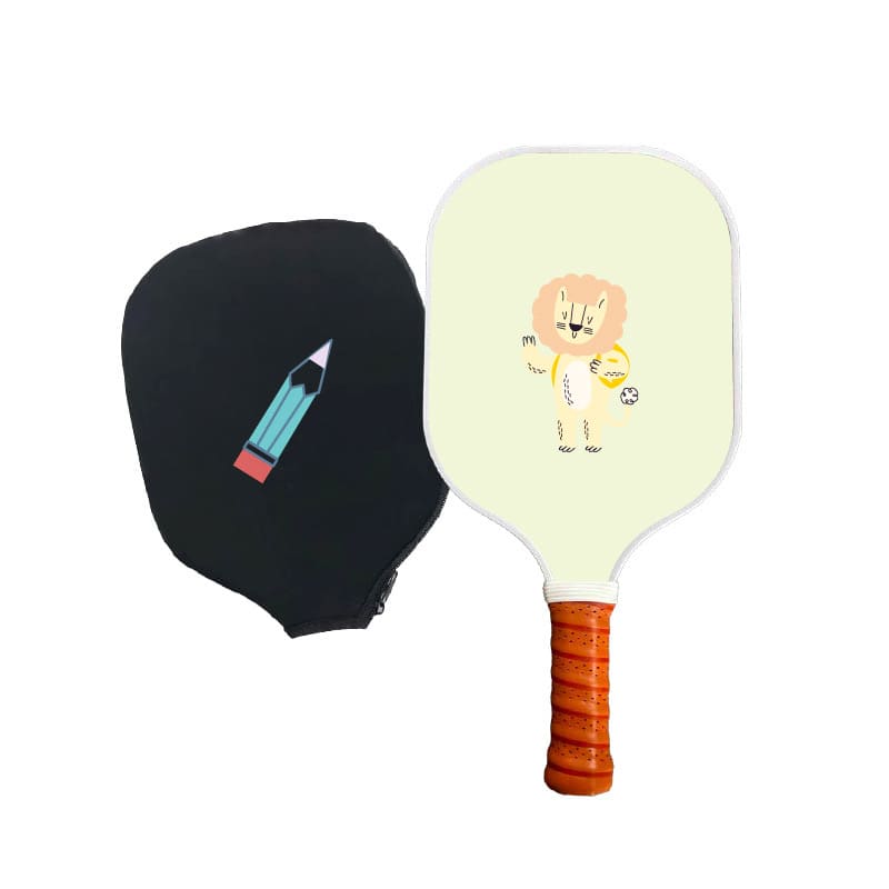
Do not include edge guard, rubber ring, grip pattern, butt cap logo, or paddle cover logo in the same file as your paddle face design. These parts are printed separately, so we need separate vector files for each.
Just send clean logo files for each accessory in vector format. No need to place them into any template unless we ask for it.
Want to Customize Box or Packaging?
If you’d like to customize your packaging or box design (such as 3-pack, 6-pack, etc.), please tell us which packaging style you want to use. We’ll send you the correct die-line. You can then place your artwork into the layout and return the file to us in vector format
Printing FAQ
What design files do you accept?
Accepted: AI / PDF (vector).
Because vector artwork is made of “lines and shapes,” not pixels, so it stays sharp when printed and enlarged. Edges will look clean and high-definition.
Not accepted: screenshots, low-resolution PNGs, social media images.
Because these are usually raster images (pixels). When enlarged, they get blurry and jagged. Color is also harder to control because it can look different on different devices.
Do you need RGB or CMYK?
Recommended: CMYK.
Because CMYK is the printing color mode, so the result is closer to real ink output and easier to control.
Not recommended: RGB for printing.
Because RGB is for screens (light-based), so it often looks brighter on your monitor. After printing, it can look less bright, especially neon-like green/blue or very vivid colors.
I designed in Adobe Illustrator. How do I change RGB to CMYK?
Please switch the document color mode in Illustrator.
Because changing only individual images isn’t enough. The most reliable way is to change the document color mode.
Steps:
File → Document Color Mode → CMYK Color
Then save, and send us the AI file or exported PDF.
Why does the green look bright in my file, but you say it will print darker?
This is normal for knockout printing (no black background / no white ink base).
Because without a white ink base, the color is printed directly onto the material, so it won’t look as bright as it does on a screen.
And carbon fiber background makes it look even darker. Because carbon fiber is naturally dark gray/black, it visually “pulls down” the brightness of the color.
Why does the same design look brighter on a full black background (full-bleed) than knockout?
Full-bleed black usually looks brighter and more saturated. Because the process often includes a white ink base layer first, then black ink, then the colors. That white base helps colors “pop.”
Knockout looks more muted and darker. Because it normally has no white base, so colors printed on a dark material will naturally look darker. This is a process difference, not a printing mistake.
Why can’t knockout printing show very bright colors like full-bleed?
Conclusion: Knockout is naturally harder to make “super bright.”
Because there’s usually no white ink base, and the exposed carbon fiber area is dark, which reduces the visual brightness.
So for the same green: Full-bleed > Knockout (brighter). That’s why we explain this in advance, so expectations match the real product.
When do you recommend adding white ink?
Recommended when you want brighter, more solid colors.Because white ink works like a “base light layer” that lifts the color, especially for light and vivid colors.
Common cases where white ink helps:
- Light/vivid colors printed on a dark background (bright green, yellow, pink)
- Full-bleed background designs
- When you care a lot about brightness and saturation
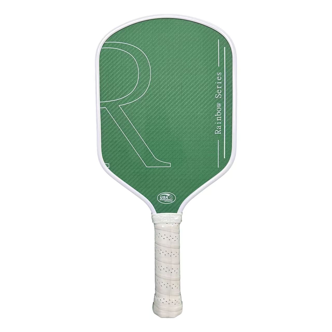
I want carbon fiber texture visible AND bright colors. Is that possible?
You can keep the carbon fiber texture visible, but the color will be more muted. Because showing the texture usually means knockout/leave-base printing, and without a white base, colors can’t be as bright as full-bleed.
If you want the color to be very bright, you’ll need full-bleed and/or white ink base. But then the carbon fiber texture will not be visible.
Simple trade-off: texture visibility vs color brightness, you choose the priority.
Why do my edges look jagged or not sharp after printing?
Most common reason: the file is raster (screenshot/PNG/social media image), and it was enlarged. Because raster images are pixels, when enlarged, they become blurry and jagged.
Best solution: send vector (AI/PDF).
If you must use images, please send the original high-resolution file (no screenshots, no compressed downloads).
Will you send a proof for confirmation? What should I check?
Yes, we will send a proof (layout/preview) before moving forward.
Because proof confirmation prevents common mistakes (wrong font, misalignment, unexpected color look).
Please check:
- Text spelling and layout (no shifting)
- Logo position, size, and proportions
- Knockout vs full-bleed areas match your expectation
- Overall color tone is acceptable (especially vivid green)
Final Checklist Before Sending
- ✅ Paddle face design is placed correctly in the provided template
- ✅ File is in AI / PDF vector format
- ✅ Only includes paddle surface design (no extra elements)
- ✅ Each accessory design is sent separately in vector format
- ✅ Packaging design (if any) is placed into correct die-line file
We’ll check the file, flag printing risks, and send a proof for your confirmation.